During the evaluation, the main critique of our design was the overambitious attempt to solve all the problems a tourist might encounter. The design was not sufficiently aimed towards solving the main problems, navigation and ticket purchases. A design solution aimed on providing help with finding restaurants, shops and accommodations only seemed to raise the complexity of the application, while not solving any of the main problems. One important point made during the evaluation was that the design treated an area too big. We should have focused more on our designated route, and not on the entirety of Stockholm. It seems that these issues stem from the brainstorming sessions. The conceptual designs derived surely satisfied all of the established requirements, but they did this in a way too broad manner. The goal with the following design changes is to more accurately solve the specific issues we've documented the tourists having.
Based on the critique we received, we have decided on some changes in the design, both conceptual and concrete. Firstly, the area treated in the design has now been restricted to Djurgården. The design will provide information regarding transportation, food and tourism attractions inside this area. We kept these categories in the design due to the obvious issues tourists had with reaching their destination, be it the Vasa Museum or the ferry terminal. This was also an argument for keeping the camera function, since it provides useful information about one's surroundings. The GPS-function has been limited. It now only provides guidance to the area we've limited the app to. Djurgården and the two ferry terminals. Receiving information about shops and accommodations was not a main concern for tourists, therefore we have removed these categories.
torsdag 28 april 2016
tisdag 26 april 2016
First prototype
We will in
this post describe in detail how our smartphone application work and the product development
process. We would be gladly happy if you followed this link
to test out our smartphone application. We have created our prototype by using the prototype tool
MyBalsamiq. MyBalsamiq was chosen mainly from its simplicity and that every
team member could be invited to the project. MyBalsamiq works in a very simply
way, we just need to create mockups,
that should illustrate our app. This prototype is the first prototype that we have
created since the paper
prototyping and sketches
that we made during the previous exercises. When creating this prototype we
mainly took the designed from the sketches and re-designed them.
After we
hade gone through the feedback that we got during exercise 4, we started to
discuss the improvements with our product and started to iterate the design to
create a more high fidelity
prototype. When designing our product we had always in mind the Fits law, we tried to
place every button/icon in a way that satisfied that law. We also tried to
visualize how our users would be satisfied with our product by thinking on how
our personas would
like our app and also how well it fits there scenarios. During the development we always
thought of making our product to achieve the usability goals and user experience goals that we previously have
discussed in the group. The usability
of the apps interface was very important for us, because people without any
major knowledge of smartphone should be able to us our product. So we tried to make
the product very understandable and easy to use.
This is the design of our first prototype by using the prototype tool MyBalsamiq:
This is the design of our first prototype by using the prototype tool MyBalsamiq:
 |
| Main menu |
When you start our app you will directly get to the main menu, where you choose between the different categories to get more information about or search after a specific topic that you need more information. At the bottom menu we have highlighted where on the application you are so that the user know on which categories they are watching. When clicking on one of the categories you will get to the Food, Amusement, Transport or City Walks menu.
 |
| Amusement Subcategory |
 |
| Transport Subcategory |
 |
| City Walks Subcategory |
 |
| Food Subcategory |
In the subcategories of the food category the user will get options on what kind of food the user would like to eat and if the user wants to search for a specific type of food, they can do that manually by typing on the search box. On the design concept we had discussed that you should be able to swipe to the right to get to the map view where all of the restaurants have been marked on the map but it’s hard to show in a conceptual design due to the fact that the prototype tool we used doesn’t support a swipe function. We solve this problem by creating a small menu bar where the user can click on 3 different options where option 1 activates the users smartphone camera and the user can get guided tour by pointing the camera towards building or places, option 2 will get you to the main menu and option 3 replaced the swipe function, by clicking on Map you will get a map view with all of the restaurants marked on the map and the user location will also be showed. The map also works offline due to the fact that one of the major requirement that we had set was that our app should work when users don’t have any internet connection.
 |
| Map over the restaurants that are near the user |
 |
| Restaurants information |
 |
| Road map over the route |
When
clicking on one of the subcategories of the food category you will get a map
view where all of that food type have been marked on the map. By clicking on
one of the red dots on map (where the red dots indicates where the restaurant
is located) you will get information on the restaurants name, working hours and
how to get there by walking or by public transportation or taxi. If the user
click on the walk button, the user will get a map where the user location have
been marked and route on how to get there. The route uses the smartphones GPS function
and also works offline.
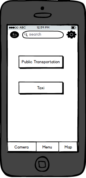


In the
subcategories of the transport category the user can plan your route and then
choice what kind of transportation you want to travel with by clicking on the
choice of transportation button. You can then choice between public
transportation or taxi.


When
clicking on the public transportation interface you can choose between travelling
with different transportations, buss, ferry, tram etc. Clicking on the start
button will bring the you a map where the travel route and the price is
showed. If the user chooses to travel
with this route, the user can then click on the payment button. The user can
then select the amount of travellers and choose between different payment
options. When clicking on the pay button, a ticket have been purchased.
 |
| Information about Vasa Museum. |
 |
| Historical Walk |
In the
subcategories of the city walk category the user can plan different city walks
that have been created for the user.
torsdag 14 april 2016
Ex 4 Evaluation feedback
"
Målgrupp
Tjänsten kan riktas lika väl mot turister som vanliga invånare (positivt).
Tjänsten kan riktas lika väl mot turister som vanliga invånare (positivt).
Enkel UI som låter målgruppen själv
välja efter sina behov (positiv).
Funktionaliteten är anpassad
språkmässigt.
På grund av att lösningen är en app kan
det vara svårt att få turisterna att använda sig eller hitta appen. En hög
“barrier of entry”, turisten kanske inte har surf i Sverige heller.
Känslan
Appen känns för “stor”, håller inte
fokus på platsen medan fokuset på målgruppen behålls.
Interaktion och övergripande struktur
Det är klart och tydligt hur man ska
använda den. Den ger fler möjligheter för turisterna att hitta olika
information men den hjälper inte riktigt med huvudproblemet, vilket är att köpa
biljetter samt att veta vart nånstans man skulle kliva av.
Funktioner och kringfunktioner
Svårt att identifiera huvudfokuset.
Försöker lösa för många frågor. Finns risk att det blir varken eller. Väldigt
många funktioner men finns ingen tydlig samhörighet bland funktionerna
Design/komposition
Det finns för många alternativ att hitta
efter rätt restaurang, nöje, shopping eller boende. Ibland vet man inte exakt
vad man är ute efter och kanske vill se saker sorterade efter vad som finns
närmast eller vad andra tycker. Folk tenderar att använda appar som enbart är
inriktade i ett område. Hotels.com, SL,
Foursquare, Yelp, AirBnb
Hjälp
Behövs inte riktigt.
Skisserna
Skisserna var lite slarviga för att dem
innehåller för mycket information där man kan gå vilse. En förbättring skulle
vara att ta upp huvud problemet först. "
Seminar 2 group notes
Discuss how the theory relates to your project?
Evaluation will be a difficult process for our target group, since the tourists are at their most useful when they need the most help. Once they have learnt how to use the ferry, they are very likely to pay less attention to the initial supportive function of our application. They will however still be useful for other functions, and we can conduct interviews in regular intervals to evaluate their experience.
Heuristic evaluation can be useful in our project to make sure we don't break standards unless we have good reasons to do so, but it will be difficult to do extensive end user testing for the same reasons as above. However, we can probably work out many of the issues by using experts in both technical areas, as well as to account for cultural factors. The user workflow can be evaluated through walkthroughs to the same extent. We want to stick to interface standards, such as the smartphone icon grid.
We believe that hypothesis testing will be needed to set the correct scope in terms of functionality. For instance, the AR camera function may be a huge component that very few users will benefit from, or it might be the biggest differentiator to the competition. Fitt's law can be used to measure the usability and accessability of our app.
What are the pros and cons of the methods you use?
Pro: Natural observation can give representative results if the observed subjects are. A cognitive walktrough with a representative group can give us good insights into how the app will be used and how collaboration can work in group usage.
Con: difficult to get test subjects for natural observation.
Have you been able to apply them in an "appropriate" way according to the theory?
We have applied cognitive walkthrough throughout our design process. Many aspects of the use of experts have been applicable through our sharing of earlier experiences in the area. We also did a lot of natural observation during our interview sessions.
Are there any methods from the theory that you would like to use in the project?
Yes.
If you had endless resources (time and money) how would you carry out your project?
We hire observers to observe tourists in their natural environment, and continously do follow-ups and evaluations to make sure we're up to date.
måndag 11 april 2016
Final Design Concept
Design 3

The third design consisted of "devices" tourists would rent during their visit. The "devices" would be locked to only access our app and would contain guides to and during visits to museums. The devices would also have RFID chip so they could be used to buy tickets for both transportation and museums. It could either get connected to your credit card and withdraw as you go or you could deposit cash to be used. Stations where you could replace empty batteries would be placed all around Stockholm
Design 4, Final

The fourth and final design implements the best parts from the previous 3. It combines a smartphone app with station/interactive screens all around Stockholm. The station would act as a supplement for people without phones and larger groups. The screens and app would both be used to find and guide the user to interesting places in Stockholm. The app contains more personal features such as paying for transportation-tickets, audio guides for museums and identifying surroundings with the camera.
Start menu:
The apps start menu lets you choose between food, entertainment, shopping and living. This is the top left paper in the picture. When a category is selected they subcategories view is opened.
Subcategories view:
This view displays the subcategories of the category selected, this view is repeated until the user has found what they are looking for. then the user swipes right to open the map view.
Map view:
Map view shows a map with the results selected in the start menu. It has a search bar on top for fast searches and buttons below to quickly add and remove categories from the map.
Camera:
Swiping left from the start menu open the camera view where the user can use the camera to identify building and sites around Stockholm and objects at museums.
Subgroup Results
The two ideas produced during the exercise differed in that one focused on the interface while the other one focused on the content.
The interface-group created simple sketches of windows displaying various categories a tourist would be interested to explore, like hotels, restaurants and attractions. Beneath each category, sub categories are displayed and at the end of each such tree, we decided to show a map and directions from the location of the tourist to the destination chosen through the browser. The implicit idea was to create a simple system, a wizard guide, for tourists to seamlessly discover an activity in a foreign city.

The content-group wanted the following:

For our summed idea we just added all features from the different groups into one package. This was possible because we basically focused on different aspects of the design. At this junction we had already gone through several cycles of prototyping. The brainstorming session had already given us an approximate idea, and the ensuing sub group discussion furthered the depth of our design. It also became clear why a conceptual design is necessary - using pen and paper is both cheap and gives a better picture of where the project is going.
The interface-group created simple sketches of windows displaying various categories a tourist would be interested to explore, like hotels, restaurants and attractions. Beneath each category, sub categories are displayed and at the end of each such tree, we decided to show a map and directions from the location of the tourist to the destination chosen through the browser. The implicit idea was to create a simple system, a wizard guide, for tourists to seamlessly discover an activity in a foreign city.
The content-group wanted the following:
- Big touch screens (about 40 inch) set up around the city that complement the tourist guide app. It displays all contents from the app so that a group of tourists can plan their activities together, and can also be used by tourists without a smart phone.
- Camera-functionality to scan objects and present information about them in the application.
- Pre-downloaded content on the application, that can be made at WiFi-connected locations.
- Face recognition at museums and public transportation for automatic payment.
- Offline GPS for a map and directions to chosen destinations.
- Phone vibration as a sign for an approaching exit from ferry, bus or train.
- A universal account to which visits to different locations and events are saved, and based on these, the user is presented with recommendations for related activities.
- Save information in a system that can share data between the big screens and personal smart phones.
- Leave messages on the big screen for other members of a group that have not reached that location.
For our summed idea we just added all features from the different groups into one package. This was possible because we basically focused on different aspects of the design. At this junction we had already gone through several cycles of prototyping. The brainstorming session had already given us an approximate idea, and the ensuing sub group discussion furthered the depth of our design. It also became clear why a conceptual design is necessary - using pen and paper is both cheap and gives a better picture of where the project is going.
Seminar 2 - Notes
The chapters required for this seminar were chapter 13 and 15 with the
first one introducing us to the general concept of evaluation, its most common
forms and the second zooming in on the ones performed without user involvement.
The chapter started of discussing the main reasons for why different forms of
evaluation are used in modern development, It’s stated that the practice of iterative
evaluation from an early stage can significaly diminish the time required for
the product to achieve the same level of result as if developed without those
measurements in place. Being able to notice obscure flaws or bugs before the official
launch and winnings of time and money are also brought up. Some main forms of
evaluation are stated. Field studies, more controlled forms of studies
involving custom lab environments built to eliminate extern variables and the
use of evaluation methods fully missing of user involvement mainly consisting
of experts performing some kind of predetermined test like heuristic
evaluation, walkthroughs or purely mathematical models. These methods all
differ greatly in ease of use, cost and time requirements and also the data
they have the possibility of generating. Field studies have as in most cases
the largest room for external interference which can skew results but also
highlight problems not previously known about the product. The main cons of
this method are the cost and the relative difficulty of execution. More
controlled forms of evaluation can include participants being located in some
form of lab or controlled environment and introduced to a task which they are
expected to perform. It’s stated that these are a good way for scientist and researchers
to test their hypothesis and receive feedback on specific scenarios. Evaluation
without the use of user input can be both cheaper and faster to conduct than
other choices and as stated before often involves the use of standardized tests
and predetermined models. My question for the seminar is for the necessity of
these tests conducted by experts. If the product is designed for the average
consumer why should it be tested by an expert who might overlock or run in to
completely different problems?
Collaborative Iteration, conclusion.
The collaborative iteration was done by picking 1-3 pain points and constructing a design based on these pain points. Initially, we decided to try and create a design that wouldn't involve a smartphone. We felt too boxed in by the idea of a smartphone app and used brain storming to try and come up with concrete designs not involving smartphones. We used keywords and sketches to document the ideas. We also created paper prototypes of our ideas. All iterations were bred from the idea of conceptual design, coming up with solutions to HCI-problems without any monetary, technical or other limitations. In the following text, each iteration summary will begin with the chosen pain points accompanied by a text concluding some of our thoughts.
Iteration 1 (no smartphone application)
- Trouble getting a ticket.
- Confused about where to step off the boat.
We began with the idea of using a system of interactive screens to remedy the pain in these pain points. Several such interactive screens would guide the user from Slussen towards the ferry terminal, making it easier to find the ferry. We thought about having a screen on the boat which shows the current position of the ferry on a map depicting its route. At each stop the ferry makes, tourist attractions in close vicinity of the stop would be displayed. This aims to help the tourist know when he or she should get off. Furthermore, we talked about placing screens close to the terminal ticket shops. From the interviews and through observation, it was obvious that tourists had problems buying tickets. An interactive screen with the ability to display ticket buying instructions in several languages could solve this issue. This eventually led us on the idea of a tracking system. The system would track the user by giving him a numerical/QR -code when buying a ticket. The system would then save the user's destination & ticket, making it possible to identify and guide the user throughout his travelling. In the end, we arrived at the smartphone trail, even though we decided to leave it out. A combination of a smartphone app and a system of interactive screens could be invaluable. The app could be used to save data and identify the user, while the screens could be improved to suit the tourists without a smartphone.
Iteration 2
- In this iteration we considered all pain points.
If we had a truly limitless amount of resources, a system of interactive screens placed throughout Gamla Stan could be used to address all of the pain points. By having one such screen in place on every city "block", a smartphone free experience could be achieved. We recycled the idea of a personal ID which tracks the user. By brainstorming and passing on ideas, we ended up with two ways of tracking the user. Tattoos, smartphone apps and bracelets. The tattoo is not a traditional one, it is rather a removable/water-soluble sticker. The bracelets were envisioned as having an ability to communicate with the wireless connection provided by the interactive screens. If a tourist encounters a tourism related problem, he could walk up to an interactive screen that recognizes him and his destination, and solve his problem. If a user needs guidance, and the user owns a smartphone, he should be able to look at a detailed map with information about attractions, restaurants etc. on his smartphone, while the interactive screens would provide a more general look at his route and destination.
Prenumerera på:
Kommentarer (Atom)