Visar inlägg med etikett Andrew. Visa alla inlägg

onsdag 18 maj 2016

Prototype video

Here are a few of the functions in the app:

Transport:

Walks:
 
 
Tickets:
 

Search:

 
Food:

Camera:
 

Settings:

Final prototype

This post will describe in detail how our latest and final smartphone application works. To test out our  smartphone application click on this link. We have now working with a project for a long time and with the iterative process we have followed we have created our final design. We have created this prototype by using the prototype tool Flinto, where we used Adobe Photoshop to create our mockups and Flinto to link our mockups together. 

After the exercise 5 where we demonstrated our first prototype we got some design critiques about the first prototype that we created. After that demo we have change a lot regarding the design and some functionality of the application, you can read more about the changes in these blog posts, post 1  and post 2. In the first prototype we had just implemented HCI theories and methods that we came in contact with when reading the course literature and during the lectures. But then realized that we needed go more studiously through the course literature and follow the links that followed each chapter end. This wasn't adequate we also search on web for reachers regarding theories about icons, colors, interface, buttons, more indent on Fitts law etc. For more in depth information you can read about the theories that we used and how we applied them in these blog posts, post 1 , post 2 , post 3 , post 4.

We have also created a video clip where we have done a walkthrough that shows all the functions of the application, you can find that video clip in this blog post.

We will now illustrate the final design of our smartphone application and go through in detail how it works. When starting the application you will directly get ot the main menu, where the user can choose between different categories or search after a specific topic depending on what type of problem the user wants help with. The user can choose between the categories My Tickets, Food, Amusement, Transport or City Walks. Each category will help the user with solving their problem on that specific area.We have also highlighted the bottom menu in the application so that the user knows on which specific menu they are at.


Main menu
If the user wants help with finding restaurants/café allocated in Djurgården, then they can enter the subcategoty Food. A scrolling list of restaurants/café is shown where they are sorted in terms of the shortest distant to the users position. Under each restaurants/café, a short information is written to indicate type of restaurants, if it's a sport bar, café, fast food etc. When clicking on one of the restaurants more in depth information is shown. Ex. if the user clicks on the restaurant Blå porten, a short description of the restaurant is found and also the opening hours, the price rate etc. If the user want to visit that specific restaurant they can get navigation from their position to Blå porten by clicking on the Directions icon. The user can always go back to the previously page by clicking on the back arrow. The map also works offline due to the fact that one of the major requirement that we had set was that our app should work when users don’t have any internet connection.


Diffrent restaurants
near the user.
In depth information
about the restaurants.
Navigation to the restaurant.


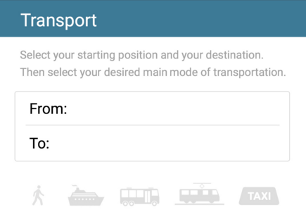
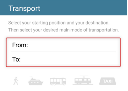
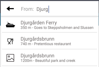
If the user knows a specific adress or place that they have a difficulty to find, they can use the Transportation function to get navigation. The Transportation function works by the user must input his location by using the smartphones position or enter a adress/place, then the destination. The user can then choose between different transportation option too travel with. If the user wants to travel with public transportation and specifically the buss ex. the current location which is at Djurgårdsbrunn to the destination Djurgården Ferry. They will get detail information about the travel route. They can also purchase tickets in the application. If the user tries too enter one of the transportation icons that are grayed out then they will get indicated to first enter the From and To field before choosing the transportation.

Main menu of the Transportation category.
Enter the position and destination, the
user will get options that starts with the
same letters as the users input.
Choose the choice of transportation.

Buss is chosen, detail information about
the travel route is shown in a more human approach.


If the user wants guided tours when exploring Djurgården, they can use their smartphones camera to point at specific buildings and places. Our application uses Augmented Reality too provide information. Ex. if the user is at the ferry that travels from Slussen to Allmänna Gränd and wants to know what a specific buildings/places is, they just have too click on the camera button in the bottom menu and point it towards that building/place. To get more information the user can click on the information icon.

Camera function, provides information of specific buildings and different
places in Djurgården.
In the My Tickets category the user will find all their active tickets and previous tickets that they have bought.

Green tickets are the active ones
and the red ones are expired.
Illustrates the ticket for traveling with public transportation.


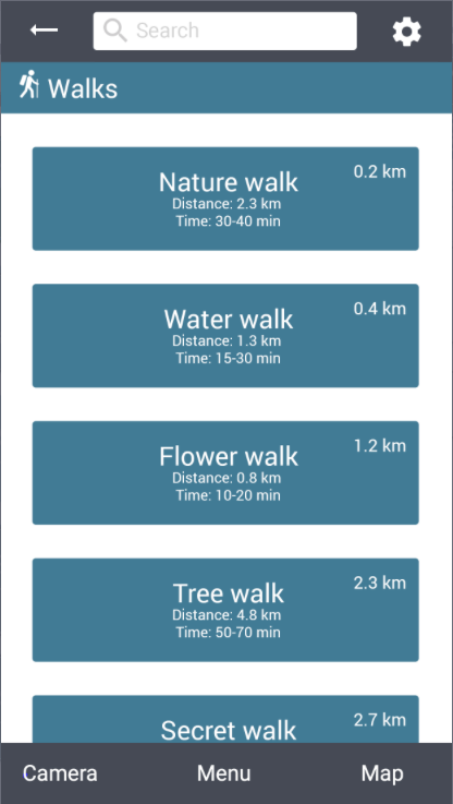
In the Walk category the user can plan different walks that have been created for the user too explore Djurgården. Every walk is specific in terms of exploring the different sides of Djurgården. A short informations is described below each Walk, where distance of the walk is shown as well as the amount of time is takes too walk this specific Walk. When clicking on a specific walk ex. the user clicks on the Nature Walk, then a more detail information is shown.

Different Walks to choose.
Information about the walks, too give the user a input on
what is waiting ahead them if they later choose this specific Walk.


The user can also change som settings in the application, the language is pre-determined as the language of the users smartphone.
The settings that the user can change or get a short tutorial of how this application work.
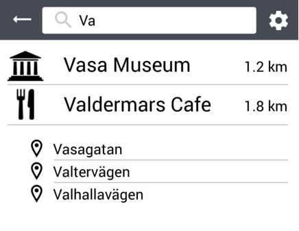
If the user know what type of "problem" they need help with then in the Search box, in the top menu. The user can input ex. Vasa museum where they gonna get information about the Vasa museum. They can also purchase tickets directly in the application.

The users input in the Search box.

Detail information about all the museums is
provided in the application.

The user can purchase tickets for the museums.

fredag 13 maj 2016

Interface choices, Buttons and the theory behind

During the iterative design process we have dealt with many difficult problems with our design and one of the biggest and important problems have been the design of our interactive buttons. During reading seminar 2 we read about Fitts Law which can be described in interaction design as; predicts the time it takes to point at a target based in the size of the object and the distance to the object. Fitt’s law can be used to measure the usability of our product. When we then started to create our first sketches and mockups, we then tried to think of the size of the buttons but we didn’t thought that much how large they should be and how we should place them. But after creating our first high fidelity prototype, we read an article on Fitts Law (1), which was established in 1945 by Paul Fitts, where this law accurately predicts the amount of time taken to move to and select a target. This law was not first intended for the human-computer interaction, it was originally developed for the movement in the physical world. In the hci term Fitts law is typically applied to movement through the graphical user interface. Later on Fitts law have been described in various mathematical ways (2 and 3

Where the time to move and point to a target of width W at a distance A is a logarithmic function of the spatial relative error (A/W)

Formula: MT=a+b log2(2A/W+c)

where
·      MT is the movement time
·      A and b are empirically determined constants, that are device dependent.
·      C is a constant of log2(2A/W) determining the difficulty.
·      A is the distance (or amplitude) of movement from start to target center
·      W is the width of the target, which corresponds to accuracy

This diagram describes how the usability index increases as
as the object size increases. Too illustrate how Fitt's Law works in
practise.

During this last iteration of the design process we have really thought of implementing Fitts law to our design in way that satisfies the law. For example. When creating our command buttons we have made them a bit bigger compared to size they where on the last prototype, after reading these article we find information that provided us with great input on the buttons size. The command button should distinguish from the non-interactive elements by size.  It becomes easier to click on it also it prevents the error of clicking on the wrong buttons.

In our first prototype the back, search and setting buttons was too close to each other, which could led to that the user could easily click on the wrong button. We did a research and found this book (Human-Computer Interaction: Interaction Technologies, Masaaki Kurosu, p.166-173) (4) that describes that the size of the buttons should be larger, because this studies result showed that the button sizes and layout have significant effect on the pointing errors. They also concluded that the error rates when tapping on buttons near the right side of the screen frame tended to high (for left-handed people) and for right-handed people the error rate tended to high when tapping on buttons near the left side of the screen.

Picture illustrating difficulty found in the study with reaching interactive buttons in the top of the screen.
When creating our second prototype we thought of this result that this study concluded and separated the back, search and setting button and made them a bit bigger. In this way we hope that the error rate for tapping on the wrong button should be minimal.

Picture of the buttons on the first prototyp,
too illustrate the changes that have been done.
Picture of the buttons on the latest prototype, the buttons
are now larger.


 We also read the human interface guidelines on apples own website (5 and 6) where they descried what the optimal size of an app icon, toolbar, setting icon etc. should be on different phones models.

Our target group is first time travellers where we have included tourist in this category. We know that many of our users from our target group will be older people and we have find a significant study (7) that shows that older adults 50+ needs bigger buttons then the average recommendations in the literature are aimed at general audiences. This study concludes that the button size should be 19.05 mm square, but previous studies also shows that the majority of the subjects express a larger preference for buttons that were large but not large, 16.51 mm and 19.05 mm.

After looking at these different studies we concluded that we should make our buttons a bit larger  so that they fit in the preference size from (16.51-19.05 mm)but not to large due to the fact that we want to make sure that usability of our app stay at the same state for all our users.


Picture of the back, search and setting function,
too illustrate the changes that have been done. 
Picture of the back, search and setting function on the latest prototype. They are now separated a bit from previous design
and have been made a bit larger so that the error rate of pointing
on the wrong button decreases.


Interface choices, platform, menus and colors.

According to one of the leading statistics companies on the internet, Statista, 60% of the european population owns a smartphone(1). This, in combination with smartphones being mobile and attractive to our target group, we thought it obvious to create a smartphone app that solves the issues highlighted during the data gathering. Since many of the issues we've encountered are related to navigation and users travelling, a smartphone is the best choice based on its size and capability. Navigational issues have previously been solved using smartphones in other apps, and they have proven to be superior to other platforms. The following text describes our process of developing a good user interface design.

The mobile information architecture we have chosen is the Hub & Spoke model (2). Each category in the main menu of our app follows the concept of having a start, a goal and different checkpoints between these two. At each checkpoint, the user is given a choice. This is a very straightforward hierarchy that aims to not overwhelm the user. This is especially important for people who are not used to computer interfaces. Another reason we chose this hierarchy is because of the potentially stressful environment the app will be used in. This idea was bred when reading about the Cognitive Approach theorem, which says that a user is generally more capable of solving one task at a time.

Another point strongly related to the user's environment is the color choices of the design. We use blue & green as background colors for our sub-menu buttons. Using the app in very bright daylight requires darker colors, while more dim environments require brighter colors. We've decided to change the contrast of the colors based on the light-sensor of the smartphone. This perfects the interface visibility in each situation. The idea to change the contrast and depth of color based on the surrounding lighting was bred after reading Murch's Rules(3). The buttons for each sub-menu have different colors. When a user enters these sub-menus, the background color of the header will be the same as the buttons, the goal of this is to increase the user's familiarity with the app, so that navigation wont be dependant on text. After a while, users will navigate only by the different colors. The idea of navigating by use of color was brought to us by Julie A. Jecko & Andrew Sears (The Human Computer Interaction Handbook, p. 133, 2003).

Main Menu


Important factors when using smarpthones to illustrate
our design choices.

Motivated application functions

The main problems highlighted in the semistructured interviews with our target group, first time travellers, were.

* Trouble buying tickets.
* Trouble finding destination.
* Not knowing what to do.

Based on these problems, we created personas, scenarios, pain points requirements. The design should help users find their destination, it should supply a simple way of purchasing tickets, it should provide multiple languages & it should provide activity suggestions. Some of our own thoughts regarding the requirements involved a small use of bandwidth & preferably being able to function offline. In addition to this, we found it obvious to provide information about restaurants/cafés since spending a day as a tourist tends to induce hunger.

With these requirements and solutions in mind we set out to create the design. We started out the iterative design process with a lot of functions and methods in mind. During the process, we realized that some of these were overambitious and slightly unnecessary. As we developed the design, we progressively focused more and more on the actual issues highlighted in the pain points & requirements

The first category in the current design is called "My Tickets". A user will find his purchased tickets in this section. We have placed it at the top, and colored it in a distinctive color, because of its importance to the user. In addition to this, a small orange notification in the top right corner of the button displays how many active tickets a user has. The second category, "Food", displays a number of restaurants/cafés with a short description sorted by their distance to the user, the closest one being at the top. 

The third category, "Amusement", contains fun things to do in Djurgården. When clicking a museum for example, a short bit of information pops up as well as distance and an option to start the GPS. This category was derived from the interviews, people did not know what to do and therefore we added the category. 

The fourth category, "Transport", is highly relevant to the issues interviewees had with finding their way around Djurgården. It provides routing information between and a start & a destination given by the user, and it provides different ways of transportation. You can also buy tickets that are valid on a specific route or during a timelimit. 

The fifth category, "Walks", was also derived from the interviews. It provides guided routes around Djurgården for any bored tourists to enjoy. It is a refreshing alternative to being indoors, and why not enjoy the beauty of Djurgården?

Interface choices, icons and functionality.

The use of icons in graphical user interfaces brings many positive aspects to usability and function. An icon can represent a word or a sentence through metaphoric design (1. An icon uses less space than words, but still depicts the functionality and purpose of a button. This makes the interface less clustered and more informative, since we're using screen space more efficiently.

The settings icon in our design is represented by a gearwheel. This is a very common symbol related to changing application settings. When a user has entered the settings mode, we have decided to gray out the settings button. This aims to alert the user that s/he can not enter the settings mode, while currently in the settings mode. A subconcept derived from the theory of Anthromorphic Approach called Constraints. In the transport section, we have used the same concept in combination with a bit of color theory to convey the current options a user has. As a user enters the transport section, the options of transportation are grayed out. To be able to pick a way of transportation, the user has to enter a start and a destination. To emphasize this, a red outlining flickers around the start & destination input when a user taps the transportational options without having entered a start & destination. When a user has started a route, a bit of text appears that tells the user how to travel. Which bus to take, where to get off etc. The text is written in a human-like manner, to apply a feeling of trust to the user. This is a subconcept of the Anthromorphic Approach.


Grayed out options when no
start & destination entered. 
Red outline to emphasize a constraint


We have used icons in the transportational section to preinform the user about the type of a certain destination. A quick example of this is when a user starts typing in "Djurgården Ferry" in the destination field, a suggestion accompanied by a ferry-icon, distance & a short description pops up.


Different icons represent the type of destination.


Some of the functionality in the design has been created with the platform in mind. For example, one of the downsides with using a mobile platform is the difficulty encountered when typing. This is relevant when using the search bar, since the user has to type. Because of this, we have designed a search bar that "suggests" relevant key phrases/words as a user starts typing. This aims to minimize the total amount of typing the user has to do.

Suggestions, icons & distance to locations.


When clicking the food section, a scrollable list appears. We have decided to place an oblong icon on the right side of the screen that conveys to the user that the list is scrollable, a common thing seen in many other phone applications. This is a sub concept of the Anthromorphic Approach called Affordances(2), using symbols & icons to convey specific actions the user can take to manipulate the interface. 


tisdag 10 maj 2016

Motivated design changes

At the last exercise, we presented our first prototype. Compared to the other prototypes our concrete design was not as visually engaging. The conceptual design was well received. We received feedback regarding the settings button not being highlighted when in the settings menu. The navigational feedback at the bottom of the app was not consistent. Today, we have decided on some changes based on this feedback, these will be summarized below. 

Firstly, we have decided on having the search bar, settings button and navigational footer statically placed. These will never disappear. The current submenu the user is in will be highlighted in the navigational footer, same goes with the settings button. 

Additional changes we've made include changing the content of the search function. A user will now be able to search for addresses, a transport option will appear that opens the map and guides the user towards a chosen destination. The food submenu has been changed. When clicking the button it now displays all of the restaurants and cafés in Djurgården ordered by their distance to the user. We decided on this since there are only 15 restaurants/cafés in Djurgården. We decided to order the amusement sub-menu in a similar fashion. This design choice is supported by the theory of automated learning (Marilyn Mantei, John Mylopoulos), designing user actions that always follow a predetermined pattern to increase learning. 

Changes to the map involve adding static WC-icons that depict public toilets. We've also added a button that appears when a route is started, the button allows the user to cancel the route. 

In the main menu, we've added a "tickets" button. The user will be able to see their purchased tickets there. We chose to place it in the main menu to make it as easy and obvious as possible to access  purchased tickets.  If the ticket is bought online, it will be usable even when the application is offline. 

måndag 2 maj 2016

Summary of think out loud sessions

The different sessions had the following in common:

Pros
  • All main problems are considered
  • Interesting augmented reality feature
  • Different languages
Cons
  • Inconsistent design elements
  • Learning curve maybe steep (for complete novices)
We will need more iterations of tests and re-designs in order to complete the design. First, we will correct the obvious mistakes visible in mybalsamiq and then we will do the final prototype in a more advanced prototyping tool.

torsdag 28 april 2016

Design changes

During the evaluation, the main critique of our design was the overambitious attempt to solve all the problems a tourist might encounter. The design was not sufficiently aimed towards solving the main problems, navigation and ticket purchases. A design solution aimed on providing help with finding restaurants, shops and accommodations only seemed to raise the complexity of the application, while not solving any of the main problems. One important point made during the evaluation was that the design treated an area too big. We should have focused more on our designated route, and not on the entirety of Stockholm. It seems that these issues stem from the brainstorming sessions. The conceptual designs derived surely satisfied all of the established requirements, but they did this in a way too broad manner. The goal with the following design changes is to more accurately solve the specific issues we've documented the tourists having.

Based on the critique we received, we have decided on some changes in the design, both conceptual and concrete. Firstly, the area treated in the design has now been restricted to Djurgården. The design will provide information regarding transportation, food and tourism attractions inside this area. We kept these categories in the design due to the obvious issues tourists had with reaching their destination, be it the Vasa Museum or the ferry terminal. This was also an argument for keeping the camera function, since it provides useful information about one's surroundings. The GPS-function has been limited. It now only provides guidance to the area we've limited the app to. Djurgården and the two ferry terminals. Receiving information about shops and accommodations was not a main concern for tourists, therefore we have removed these categories.


tisdag 26 april 2016

First prototype


We will in this post describe in detail how our smartphone application work and the product development process. We would be gladly happy if you followed this link to test out our smartphone application. We have created our prototype by using the prototype tool MyBalsamiq. MyBalsamiq was chosen mainly from its simplicity and that every team member could be invited to the project. MyBalsamiq works in a very simply way, we just need to create mockups, that should illustrate our app. This prototype is the first prototype that we have created since the paper prototyping and sketches that we made during the previous exercises. When creating this prototype we mainly took the designed from the sketches and re-designed them.

After we hade gone through the feedback that we got during exercise 4, we started to discuss the improvements with our product and started to iterate the design to create a more high fidelity prototype. When designing our product we had always in mind the Fits law, we tried to place every button/icon in a way that satisfied that law. We also tried to visualize how our users would be satisfied with our product by thinking on how our personas would like our app and also how well it fits there scenarios. During the development we always thought of making our product to achieve the usability goals and user experience goals that we previously have discussed in the group. The usability of the apps interface was very important for us, because people without any major knowledge of smartphone should be able to us our product. So we tried to make the product very understandable and easy to use. 

This is the design of our first prototype by using the prototype tool MyBalsamiq:

Main menu


When you start our app you will directly get to the main menu, where you choose between the different categories to get more information about or search after a specific topic that you need more information. At the bottom menu we have highlighted where on the application you are so that the user know on which categories they are watching. When clicking on one of the categories you will get to the Food, Amusement, Transport or City Walks menu.


Amusement Subcategory
Transport Subcategory
City Walks Subcategory
Food Subcategory


In the subcategories of the food category the user will get options on what kind of food the user would like to eat and if the user wants to search for a specific type of food, they can do that manually by typing on the search box. On the design concept we had discussed that you should be able to swipe to the right to get to the map view where all of the restaurants have been marked on the map but it’s hard to show in a conceptual design due to the fact that the prototype tool we used doesn’t support a swipe function. We solve this problem by creating a small menu bar where the user can click on 3 different options where option 1 activates the users smartphone camera and the user can get guided tour by pointing the camera towards building or places, option 2 will get you to the main menu and option 3 replaced the swipe function, by clicking on Map you will get a map view with all of the restaurants marked on the map and the user location will also be showed. The map also works offline due to the fact that one of the major requirement that we had set was that our app should work when users don’t have any internet connection.

Map over the restaurants that are near the user 
Restaurants information
Road map over the route
When clicking on one of the subcategories of the food category you will get a map view where all of that food type have been marked on the map. By clicking on one of the red dots on map (where the red dots indicates where the restaurant is located) you will get information on the restaurants name, working hours and how to get there by walking or by public transportation or taxi. If the user click on the walk button, the user will get a map where the user location have been marked and route on how to get there. The route uses the smartphones GPS function and also works offline.


Choice of transportation
Taxi options
Ferry Options


In the subcategories of the transport category the user can plan your route and then choice what kind of transportation you want to travel with by clicking on the choice of transportation button. You can then choice between public transportation or taxi.


Map over the ferry route 
Payment

When clicking on the public transportation interface you can choose between travelling with different transportations, buss, ferry, tram etc. Clicking on the start button will bring the you a map where the travel route and the price is showed.  If the user chooses to travel with this route, the user can then click on the payment button. The user can then select the amount of travellers and choose between different payment options. When clicking on the pay button, a ticket have been purchased.


Information about Vasa Museum.
In the subcategories of the amusement category the user can get information about the different amusement parks around Djurgården. By clicking on a amusement park, the information on that park is described and if the user wants more information then they can click on the wiki text.

Historical Walk

In the subcategories of the city walk category the user can plan different city walks that have been created for the user.