During the iterative design process
we have dealt with many difficult problems with our design and one of the
biggest and important problems have been the design of our interactive buttons.
During reading seminar 2 we read about Fitts Law which can be described in interaction design as; predicts the time it
takes to point at a target based in the size of the object and the distance to
the object. Fitt’s law can be used to measure the usability of our product. When we then
started to create our first sketches
and mockups, we
then tried to think of the size of the buttons but we didn’t thought that much
how large they should be and how we should place them. But after creating our
first high fidelity
prototype, we read an article on Fitts Law (1),
which was established in 1945 by Paul Fitts, where this law accurately predicts
the amount of time taken to move to and select a target. This law was not first
intended for the human-computer
interaction, it was originally developed for the movement in the physical
world. In the hci term Fitts law is typically applied to movement through the graphical user interface.
Later on Fitts law have been described in various mathematical ways (2 and 3)
Where the time
to move and point to a target of width W at a distance A is a logarithmic
function of the spatial relative error (A/W)
Formula:
MT=a+b log2(2A/W+c)
where
· MT is the movement time
· A and b are empirically determined
constants, that are device dependent.
· C is a constant of log2(2A/W) determining the difficulty.
· A is the distance (or amplitude) of
movement from start to target center
· W is the width of the target, which
corresponds to accuracy
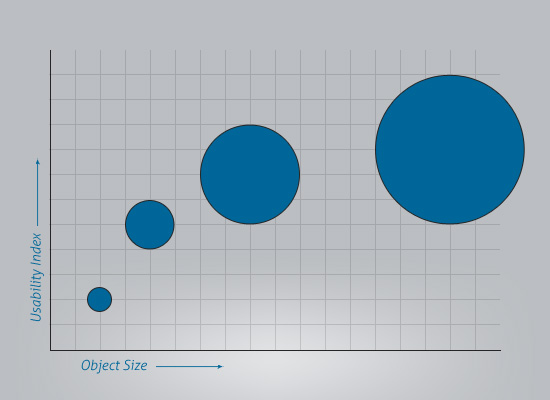 |
| This diagram describes how the usability index increases as as the object size increases. Too illustrate how Fitt's Law works in practise. |
During this
last iteration of the design process we have really thought of implementing
Fitts law to our design in way that satisfies the law. For example. When
creating our command buttons we have made them a bit bigger compared to size
they where on the last prototype, after reading these article we find
information that provided us with great input on the buttons size. The command
button should distinguish from the non-interactive elements by size. It becomes easier to click on it also it
prevents the error of clicking on the wrong buttons.
In our
first prototype the back, search and setting buttons was too close to each other,
which could led to that the user could easily click on the wrong button. We did a research
and found this book (Human-Computer Interaction: Interaction Technologies, Masaaki Kurosu, p.166-173) (4) that
describes that the size of the buttons should be larger, because this studies
result showed that the button sizes and layout have significant effect on the
pointing errors. They also concluded that the error rates when tapping on
buttons near the right side of the screen frame tended to high (for left-handed
people) and for right-handed people the error rate tended to high when tapping
on buttons near the left side of the screen.
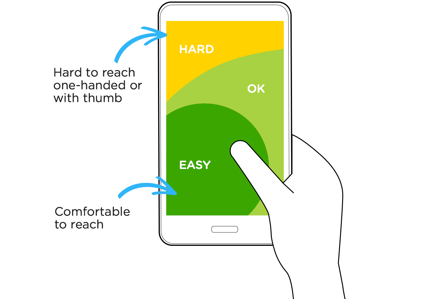 |
| Picture illustrating difficulty found in the study with reaching interactive buttons in the top of the screen. |
When
creating our second prototype we thought of this result that this study concluded
and separated the back, search and setting button and made them a bit bigger.
In this way we hope that the error rate for tapping on the wrong button should
be minimal.
 |
| Picture of the buttons on the first prototyp, too illustrate the changes that have been done. |
 |
| Picture of the buttons on the latest prototype, the buttons are now larger. |
We also read the human interface guidelines on apples own website (5 and 6) where they descried what the optimal size of an app icon,
toolbar, setting icon etc. should be on different phones models.
Our target group is first
time travellers where we have included tourist in this category. We know that
many of our users from our target group will be older people and we have find a
significant study (7) that shows
that older adults 50+ needs bigger buttons then the average recommendations in
the literature are aimed at general audiences. This study concludes that the
button size should be 19.05 mm square, but previous studies also shows that the
majority of the subjects express a larger preference for buttons that were
large but not large, 16.51 mm and 19.05 mm.
After
looking at these different studies we concluded that we should make our buttons
a bit larger so that they fit in the preference size from (16.51-19.05 mm)but not to large due to the fact that we want to make sure that usability of our app stay
at the same state for all our users.
 |
| Picture of the back, search and setting function, too illustrate the changes that have been done. |
 |
| Picture of the back, search and setting function on the latest prototype. They are now separated a bit from previous design and have been made a bit larger so that the error rate of pointing on the wrong button decreases. |
Inga kommentarer:
Skicka en kommentar