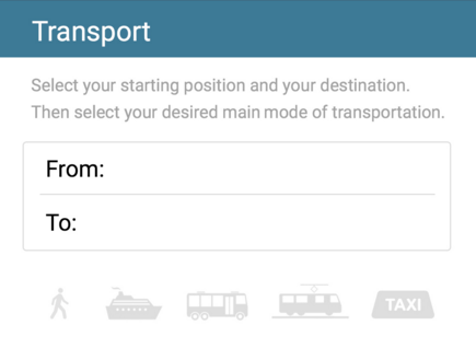
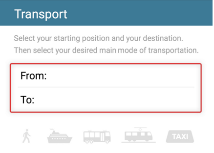
The settings icon in our design is represented by a gearwheel. This is a very common symbol related to changing application settings. When a user has entered the settings mode, we have decided to gray out the settings button. This aims to alert the user that s/he can not enter the settings mode, while currently in the settings mode. A subconcept derived from the theory of Anthromorphic Approach called Constraints. In the transport section, we have used the same concept in combination with a bit of color theory to convey the current options a user has. As a user enters the transport section, the options of transportation are grayed out. To be able to pick a way of transportation, the user has to enter a start and a destination. To emphasize this, a red outlining flickers around the start & destination input when a user taps the transportational options without having entered a start & destination. When a user has started a route, a bit of text appears that tells the user how to travel. Which bus to take, where to get off etc. The text is written in a human-like manner, to apply a feeling of trust to the user. This is a subconcept of the Anthromorphic Approach.
 |
| Grayed out options when no start & destination entered. |
 |
| Red outline to emphasize a constraint |
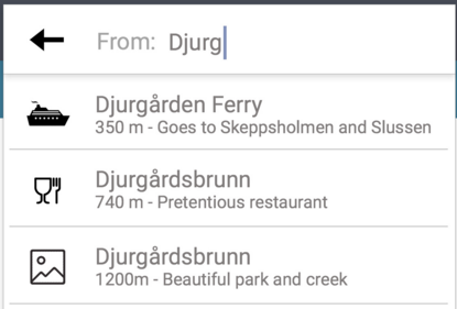
We have used icons in the transportational section to preinform the user about the type of a certain destination. A quick example of this is when a user starts typing in "Djurgården Ferry" in the destination field, a suggestion accompanied by a ferry-icon, distance & a short description pops up.
 |
| Different icons represent the type of destination. |
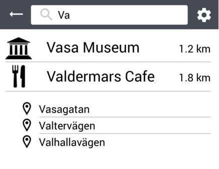
Some of the functionality in the design has been created with the platform in mind. For example, one of the downsides with using a mobile platform is the difficulty encountered when typing. This is relevant when using the search bar, since the user has to type. Because of this, we have designed a search bar that "suggests" relevant key phrases/words as a user starts typing. This aims to minimize the total amount of typing the user has to do.
 |
| Suggestions, icons & distance to locations. |
When clicking the food section, a scrollable list appears. We have decided to place an oblong icon on the right side of the screen that conveys to the user that the list is scrollable, a common thing seen in many other phone applications. This is a sub concept of the Anthromorphic Approach called Affordances(2), using symbols & icons to convey specific actions the user can take to manipulate the interface.
Inga kommentarer:
Skicka en kommentar