lördag 28 maj 2016

Summary of the Project and Final Reflections


Problem analysis & field studies
The premise of the course was to create a product (up to a prototype) for a particular problem encountered on a geographic site connected to public transportation. We picked the ferry line between Slussen and Allmänna gränd for our project,and our target group would be foreign tourists or first time visitors. To formulate a problem we first did a pilot study to get a feel for the place through observation and unstructured interviews. This enabled us to formulate more exact questions, which we posed to travelers on the line a couple of days later in more structured interviews. The gathering technique used was very basic. We worked in pair and while one of us was asking questions, the other one wrote down the answers. A more advanced gathering technique like video or audio recording seemed to us too intrusive and therefore counter productive. A challenge was to formulate an idea based entirely on the empirical data that we recorded during our field work without prejudice. The first step was to categorize our data for qualitative and quantitative analysis. We tried to group similar problems together and count the occurrences of each problem. Since different subjects expressed themselves in different ways we had to interpret the answers to know if there were any recurring patterns. The problems that most people faced were:
  • How do I purchase a ticket?
  • Where do I go when I get off the ferry
  • What activities are there in the city?
In conjunction with contextual interviews, state of the art analyses were conducted. The purpose of them was both to trigger the imagination and perhaps also to steer us away from creating a design that already exists. We concluded that there are no current solution that solves all of the above mentioned problems, that most travel guides rely on an internet connection and no current solution have asian languages.

Persona and Scenarios
Based on these problems we set out to create a requirements specification, and the usual way to do this is through personas. Personas enabled us to embody the problems and see them in practical action. We could better analyze user experience goals and through informal narrative description we could formulate human activity in a specific context. In retrospect our attempt to formulate two different personas was very successful. We wanted to include a broad spectrum of potential users with different consumer technology skills and interests. Our main persona Sonya was an early adopter, which means that she had an active interest in new technology and used it whenever she could. Her setting was that of a family vacation in different degrees of turmoil. Already here it became apparent to us that our solution must fit in a situation with many conflicting desires, be available and seamless with high quality usability. Our secondary persona, Luis, was put in a more lonely setting and his indifference to technology prompted us again to create something so easy that it barely could be described as technology but rather a second nature.

By creating personas we automatically line up with the recommendations in ISO-9241-11 that points out the importance of defining usability in terms of user goals and context of use. In this case we are all the time focusing on practical issues of navigation for tourists. User centered systems design has the strength that it forces developers to envision themselves in somebody else's situation. We are not developing tools for ourselves but for users whose needs and predispositions are very different from ours. Now at the end of the course one can see that we have followed the the core idea of UCSD by involving users throughout the entire project but since the project was short, we could of course only make few iterations of involving users. These were the think aloud method and in some respect the evaluation by other students.

Designing & prototyping
Here, at the first brainstorming session, we became ready to establish the first requirements and begin the first cycle of prototyping. The session included collaborative iteration and parallel design. The first segment, collaborative iteration, was meant to produce all imaginable ideas, from the most concrete and practical to the most wild and unrealistic. The idea at this stage is to encourage reflection, shut off the common censor, and by allowing input from every group member by turns, encourage participatory design. This technique proved useful as members with otherwise good ideas but quiet personalities could make themselves heard. How to make use of introvert personalities is a contemporary managerial question and although strictly speaking group dynamics is not part of the course, this problem still surfaces, especially since a mayor component of the course is the peer feedback. This technique took some load off this problem.

With some results now available, we decided to focus on a mobile app with a complementary screen that would be spread out across the city and used on its own or together with the mobile app. We were looking to create an all-in-one package that could solve ticket, navigation and activity finding issues. With these guiding principles we went on to the second segment, the parallel design, in which we divided into two groups each creating sketches through paper prototypes. By using post-it notes in different colors ideas could be quickly created and organized into a conceptual design. The two groups spontaneously and unconsciously worked on different aspects of the prototype, one focused on content and the other on the interface. After a third design concept some days later, we took the best aspects of each prototype and combined them into a final prototype idea. Our design had become a mobile application that through a browsing interface presented the user with various activities and a navigation system to take him or her there. It also included a ticket buying system for transportation and an augmented reality mode for recognition and description of famous sites.

Evaluation
The main evaluation session took place during an exercise with one of the other groups acting as an evaluator of our design. Usually, an expert evaluator denotes a person trained in evaluation with extensive experience of judging designs and theories about proper design choices. Our comrade students could hardly be called experts in this sense but as computer science undergraduates, they neither could be called laymen, so they took on the role as expert in evaluating our design using some kind of frame work to come to conclusions. It is not known what method was used by our evaluators to make the judgements. We were just handed a list of positive and negative aspects of our design. At least we know the tests were conducted in a highly controlled environment, since they were conducted by experts.

Our own evaluation strategy was based on Nielsen's rules of thumb, a checklist of features a good design should have, and an approach which is a part of the heuristics method. Before embarking on this formal approach we made a quick walkthrough of the design, intuitively imagining how it would be to use the design in real life by embodying different roles and intentions. The design we critiqued was a system for buying tickets for public transport, which basically was an interactive touch screen. There are many other evaluation methods, some more and some less relevant for this course since it is limited in scope and time. The KLM method, used for measuring the time it takes for each key stroke, swipe, etc, to complete a task, would prove itself pointless as it is tedious and differences in micro seconds between designs would not register for our purposes. A cognitive walkthrough on the other hand, a method for studying how a small aspect of a design helps problem solving, could be interesting as problem solving of a practical issue of transportation is a marked premise of the course. Next followed a more concrete design of our paper design in a relatively low-fidelity prototype using the tool myBalsamiq. The purpose was to get our ideas on screen and connect its different parts into a preliminary whole.
This prototype was taken for a test drive using think aloud sessions where subjects commented on our design in real time while navigating around it. It became apparent that while the problems that our project was based on were all addressed, there remained inconsistencies in some of the design elements. To properly handle this we chose to switch prototype tool to Flinto.

Design critique, design iteration
We presented our low-fidelity prototype during an exercise and got some new feedback, making this yet another iteration of the design process. Similar issues came up this time as during the think aloud sessions but more importantly we got some esthetic feedback that concerned symbols on the screen. For instance there were some issues with the cogwheel button that takes the user to the 
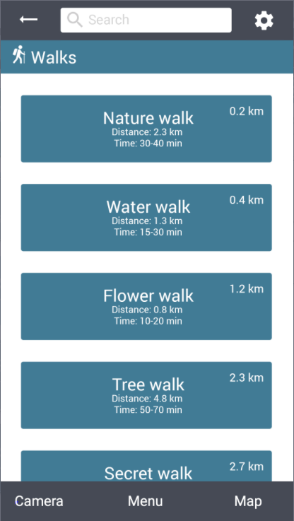
settings page. This critique turned our attention to images and our final design has far more pictures than our first one. At this stage we began to study general design theory to back up our design choices with literature in the subject, while using Flinto and Photoshop to create a high-fidelity prototype.

Final thoughts
Our estimation is that we did a good job, both regarding the project process and final prototype results. We met regularly and structured the work load evenly with everyone performing their part. If only one thing would be taken away from the course as its most valuable lesson, it might be the UCSD approach to product development. By working closer with the users we were able to create something useful not only in theory but also in practice. It shows how developers and end users can disagree in their understanding of the concept of usability. This does not mean that the practical side of design dominates the theoretical side, the theoretical idea of practical engagement with end users is just as important. Without the ability to link practice to its theoretical component, practice can become automatic, contingent and lack self awareness. The strength and elegance of UCSD then is the theoretical formulation of the primacy of (end user) practice. For computer science engineering is spreading to virtually every sector of the economy and culture everywhere. It will become important that developers can keep the integrity of each sector so that computers and software work for them and not the other way around.

onsdag 18 maj 2016

Prototype video

Here are a few of the functions in the app:

Transport:

Walks:
 
 
Tickets:
 

Search:

 
Food:

Camera:
 

Settings:

Final prototype

This post will describe in detail how our latest and final smartphone application works. To test out our  smartphone application click on this link. We have now working with a project for a long time and with the iterative process we have followed we have created our final design. We have created this prototype by using the prototype tool Flinto, where we used Adobe Photoshop to create our mockups and Flinto to link our mockups together. 

After the exercise 5 where we demonstrated our first prototype we got some design critiques about the first prototype that we created. After that demo we have change a lot regarding the design and some functionality of the application, you can read more about the changes in these blog posts, post 1  and post 2. In the first prototype we had just implemented HCI theories and methods that we came in contact with when reading the course literature and during the lectures. But then realized that we needed go more studiously through the course literature and follow the links that followed each chapter end. This wasn't adequate we also search on web for reachers regarding theories about icons, colors, interface, buttons, more indent on Fitts law etc. For more in depth information you can read about the theories that we used and how we applied them in these blog posts, post 1 , post 2 , post 3 , post 4.

We have also created a video clip where we have done a walkthrough that shows all the functions of the application, you can find that video clip in this blog post.

We will now illustrate the final design of our smartphone application and go through in detail how it works. When starting the application you will directly get ot the main menu, where the user can choose between different categories or search after a specific topic depending on what type of problem the user wants help with. The user can choose between the categories My Tickets, Food, Amusement, Transport or City Walks. Each category will help the user with solving their problem on that specific area.We have also highlighted the bottom menu in the application so that the user knows on which specific menu they are at.


Main menu
If the user wants help with finding restaurants/café allocated in Djurgården, then they can enter the subcategoty Food. A scrolling list of restaurants/café is shown where they are sorted in terms of the shortest distant to the users position. Under each restaurants/café, a short information is written to indicate type of restaurants, if it's a sport bar, café, fast food etc. When clicking on one of the restaurants more in depth information is shown. Ex. if the user clicks on the restaurant Blå porten, a short description of the restaurant is found and also the opening hours, the price rate etc. If the user want to visit that specific restaurant they can get navigation from their position to Blå porten by clicking on the Directions icon. The user can always go back to the previously page by clicking on the back arrow. The map also works offline due to the fact that one of the major requirement that we had set was that our app should work when users don’t have any internet connection.


Diffrent restaurants
near the user.
In depth information
about the restaurants.
Navigation to the restaurant.


If the user knows a specific adress or place that they have a difficulty to find, they can use the Transportation function to get navigation. The Transportation function works by the user must input his location by using the smartphones position or enter a adress/place, then the destination. The user can then choose between different transportation option too travel with. If the user wants to travel with public transportation and specifically the buss ex. the current location which is at Djurgårdsbrunn to the destination Djurgården Ferry. They will get detail information about the travel route. They can also purchase tickets in the application. If the user tries too enter one of the transportation icons that are grayed out then they will get indicated to first enter the From and To field before choosing the transportation.

Main menu of the Transportation category.
Enter the position and destination, the
user will get options that starts with the
same letters as the users input.
Choose the choice of transportation.

Buss is chosen, detail information about
the travel route is shown in a more human approach.


If the user wants guided tours when exploring Djurgården, they can use their smartphones camera to point at specific buildings and places. Our application uses Augmented Reality too provide information. Ex. if the user is at the ferry that travels from Slussen to Allmänna Gränd and wants to know what a specific buildings/places is, they just have too click on the camera button in the bottom menu and point it towards that building/place. To get more information the user can click on the information icon.

Camera function, provides information of specific buildings and different
places in Djurgården.
In the My Tickets category the user will find all their active tickets and previous tickets that they have bought.

Green tickets are the active ones
and the red ones are expired.
Illustrates the ticket for traveling with public transportation.


In the Walk category the user can plan different walks that have been created for the user too explore Djurgården. Every walk is specific in terms of exploring the different sides of Djurgården. A short informations is described below each Walk, where distance of the walk is shown as well as the amount of time is takes too walk this specific Walk. When clicking on a specific walk ex. the user clicks on the Nature Walk, then a more detail information is shown.

Different Walks to choose.
Information about the walks, too give the user a input on
what is waiting ahead them if they later choose this specific Walk.


The user can also change som settings in the application, the language is pre-determined as the language of the users smartphone.
The settings that the user can change or get a short tutorial of how this application work.
If the user know what type of "problem" they need help with then in the Search box, in the top menu. The user can input ex. Vasa museum where they gonna get information about the Vasa museum. They can also purchase tickets directly in the application.

The users input in the Search box.

Detail information about all the museums is
provided in the application.

The user can purchase tickets for the museums.

fredag 13 maj 2016

Interface choices, Buttons and the theory behind

During the iterative design process we have dealt with many difficult problems with our design and one of the biggest and important problems have been the design of our interactive buttons. During reading seminar 2 we read about Fitts Law which can be described in interaction design as; predicts the time it takes to point at a target based in the size of the object and the distance to the object. Fitt’s law can be used to measure the usability of our product. When we then started to create our first sketches and mockups, we then tried to think of the size of the buttons but we didn’t thought that much how large they should be and how we should place them. But after creating our first high fidelity prototype, we read an article on Fitts Law (1), which was established in 1945 by Paul Fitts, where this law accurately predicts the amount of time taken to move to and select a target. This law was not first intended for the human-computer interaction, it was originally developed for the movement in the physical world. In the hci term Fitts law is typically applied to movement through the graphical user interface. Later on Fitts law have been described in various mathematical ways (2 and 3

Where the time to move and point to a target of width W at a distance A is a logarithmic function of the spatial relative error (A/W)

Formula: MT=a+b log2(2A/W+c)

where
·      MT is the movement time
·      A and b are empirically determined constants, that are device dependent.
·      C is a constant of log2(2A/W) determining the difficulty.
·      A is the distance (or amplitude) of movement from start to target center
·      W is the width of the target, which corresponds to accuracy

This diagram describes how the usability index increases as
as the object size increases. Too illustrate how Fitt's Law works in
practise.

During this last iteration of the design process we have really thought of implementing Fitts law to our design in way that satisfies the law. For example. When creating our command buttons we have made them a bit bigger compared to size they where on the last prototype, after reading these article we find information that provided us with great input on the buttons size. The command button should distinguish from the non-interactive elements by size.  It becomes easier to click on it also it prevents the error of clicking on the wrong buttons.

In our first prototype the back, search and setting buttons was too close to each other, which could led to that the user could easily click on the wrong button. We did a research and found this book (Human-Computer Interaction: Interaction Technologies, Masaaki Kurosu, p.166-173) (4) that describes that the size of the buttons should be larger, because this studies result showed that the button sizes and layout have significant effect on the pointing errors. They also concluded that the error rates when tapping on buttons near the right side of the screen frame tended to high (for left-handed people) and for right-handed people the error rate tended to high when tapping on buttons near the left side of the screen.

Picture illustrating difficulty found in the study with reaching interactive buttons in the top of the screen.
When creating our second prototype we thought of this result that this study concluded and separated the back, search and setting button and made them a bit bigger. In this way we hope that the error rate for tapping on the wrong button should be minimal.

Picture of the buttons on the first prototyp,
too illustrate the changes that have been done.
Picture of the buttons on the latest prototype, the buttons
are now larger.


 We also read the human interface guidelines on apples own website (5 and 6) where they descried what the optimal size of an app icon, toolbar, setting icon etc. should be on different phones models.

Our target group is first time travellers where we have included tourist in this category. We know that many of our users from our target group will be older people and we have find a significant study (7) that shows that older adults 50+ needs bigger buttons then the average recommendations in the literature are aimed at general audiences. This study concludes that the button size should be 19.05 mm square, but previous studies also shows that the majority of the subjects express a larger preference for buttons that were large but not large, 16.51 mm and 19.05 mm.

After looking at these different studies we concluded that we should make our buttons a bit larger  so that they fit in the preference size from (16.51-19.05 mm)but not to large due to the fact that we want to make sure that usability of our app stay at the same state for all our users.


Picture of the back, search and setting function,
too illustrate the changes that have been done. 
Picture of the back, search and setting function on the latest prototype. They are now separated a bit from previous design
and have been made a bit larger so that the error rate of pointing
on the wrong button decreases.